Optimizing Large Dataset Rendering with Server-Side Pagination in Vue 3 + Django
Upgraded a legacy frontend from Vue 2 + Bootstrap to a modern Vue 3 stack using Composition API, TypeScript, and Vuetify — while helping modularize the Django backend.
Making Large Tables Perform Like Small Ones
While working as a contractor, I was tasked with modernizing a legacy web application. The frontend was built using Vue 2 (Options API), Bootstrap, and plain JavaScript. It loaded large datasets into memory and rendered everything at once — which made it sluggish and hard to navigate.
🧩 What I Improved
- Server-Side Pagination: Instead of fetching thousands of records at once, the frontend now loads just one page at a time, based on filters and user actions.
- Modular Filters & Search: Users can refine results using multiple filters without triggering unnecessary queries or mixing unrelated data.
- Clean UX:
- Changing views resets pagination and search, eliminating stale UI issues.
- Combined use of filters + pagination is intuitive and smooth.
- Fast response time regardless of dataset size.
🧪 Testing & Edge Cases
- Verified all filter and pagination combinations behave correctly.
- Tested search isolation to ensure no overlap or data leakage.
- Confirmed that no visual glitches occur when toggling views quickly.
⚙️ The Stack Behind It
- Frontend: Vue 3 + Composition API + TypeScript + Vuetify
- Backend: Django REST Framework with paginated JSON responses
- Extra Work: I also helped modularize and refactor the backend, improving maintainability and performance of key endpoints.
This work resulted in significantly faster page loads, cleaner separation of concerns, and a better experience across devices.
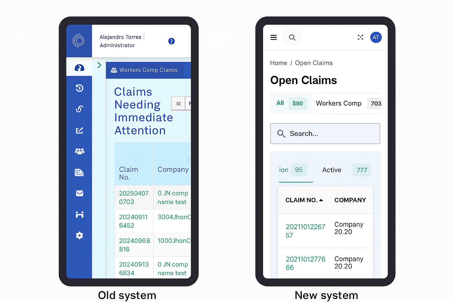
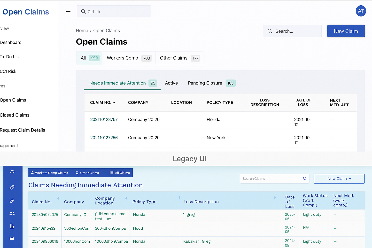
🖼 Before & After: UI and Performance Improvements
Below are visual comparisons between the legacy system and the upgraded version:
💻 Desktop View
Before: Legacy UI with no pagination and outdated design After: Modern Vue 3 + Vuetify design with responsive layout and pagination
📱 Mobile View
Before: Not responsive and hard to use on smaller screens After: Fully responsive and optimized for mobile usage